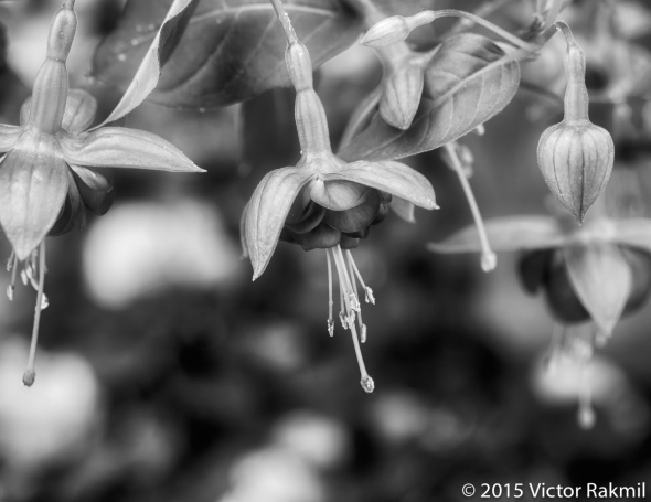
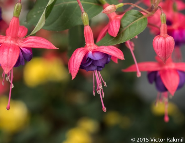
Color and Black and White (Two Photographs)
 To view more of my photography please click on www.rakmilphotography.com
Some of the most famous photographs in the world have been taken in Black and White and it remains an important area of photography. With digital photography Black and White is now something more often done in post processing than in-camera. I returned to Black and White in the past few years, selecting photographs that had the right elements of contrast, composition and subject. In my view it’s harder to do right than processing in color. That is not exactly the way it should be, color depends on quite a few factors: the calibration of your monitor, the color work space of your camera, the white balance you chose to shoot in, the processing software color profile, and the color profile you select in your camera. Color is a science in itself. In Lightroom and Photoshop we have the option to change the camera profiles, change the color space to suit; in addition many of the plug-ins for those applications also affect color. This photograph was taken with a Olympus OMD which has some interesting and dramatic color profiles. In short there are as many options with color as with Black and White, all worth exploring. In my experience vibrant colors can have a dramatic impact; Black and White can isolate the essence of the scene and subject. Both can be used to direct your audience to the nature of your subject. I like how the photographs here have come out but they are two very different photographs.

I really like the black and white. The contrast is beautiful and it really makes you think about how complex nature is. You really grasped these point in your photographs. Follow me
LikeLike
August 28, 2015 at 5:06 pm
Thanks
LikeLiked by 1 person
August 28, 2015 at 5:41 pm
I must say, I like the colour version best because this is such a vibrant flower…but perhaps we appreciate the balletic nature of the flower in monochrome…..
LikeLike
August 28, 2015 at 4:20 pm
Thanks
LikeLike
August 28, 2015 at 4:39 pm
Yes, they are very different. I prefer the color because I know the flower and expect it in color.
LikeLike
August 28, 2015 at 11:08 am
Thanks. Good point.
LikeLike
August 28, 2015 at 2:44 pm
I prefer the b&w version because it feels like a dream to enter.
LikeLike
August 28, 2015 at 10:44 am
Thanks. Interesting how you describe it.
LikeLike
August 28, 2015 at 2:43 pm
Nicely done, Victor. In this case, I prefer the colour version; the flowers stand out better against the bright spots in the background.
LikeLiked by 1 person
August 28, 2015 at 9:07 am
Thanks. I think you are right.
LikeLike
August 28, 2015 at 9:20 am
These Fuchsia are not too common to happen upon! They need a special place to grow.
Wonderful photos! 😃
LikeLike
August 28, 2015 at 6:42 am
Thanks.
LikeLike
August 28, 2015 at 7:44 am
How we use color or black and white in post procesing can radically change an image. That is where art enters the picture. I agree with you.
LikeLiked by 1 person
August 28, 2015 at 3:23 am